Project Brief
OCAD University has individual international student teams that function from separate office spaces. Students usually get confused amongst each of the teams and fail to recognize the teams and their individual functions.
OCAD U's International email account receives queries that are misdirected, due to the confusion and lack of awareness in students. This means, the team faces difficulties to get back to all queries properly and on time!
Employer
OCAD University
Role
Visual Design Monitor
Graphic Designer
Year
2019-2020

Employee Excellence Award
Received Employee Excellence Award at OCAD U as a student employee, recognized for the outstanding design work produced.
Excellence Award
Received Employee Excellence Award at OCAD U as a student employee, recognized for the outstanding design work produced.
The Solution
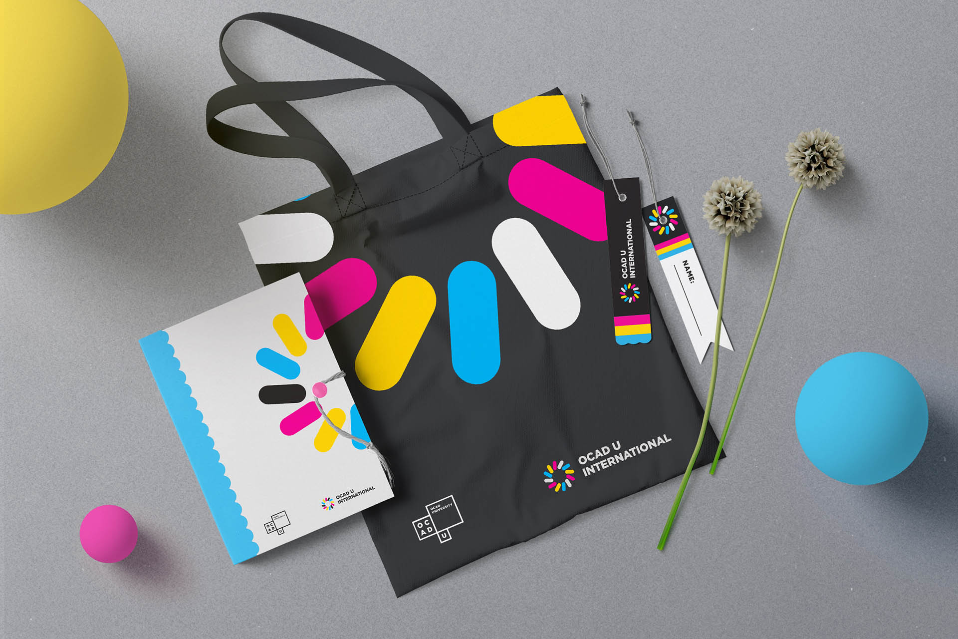
A modular branding and logo system designed to represent the umbrella term "OCAD U International" that unites the three OCAD U International teams: International Projects & Partnerships, International Admissions, International Student Support & Exchange Programs, to represent their united as well as individual identities, that are distinguished by the work they do.
The logo System
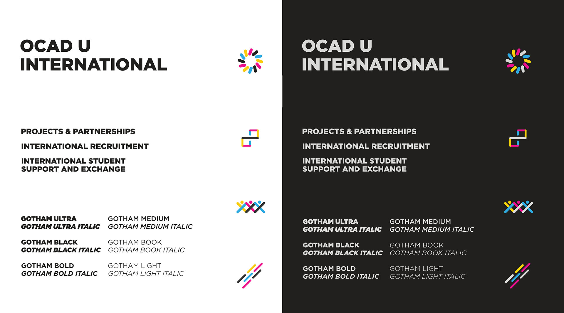
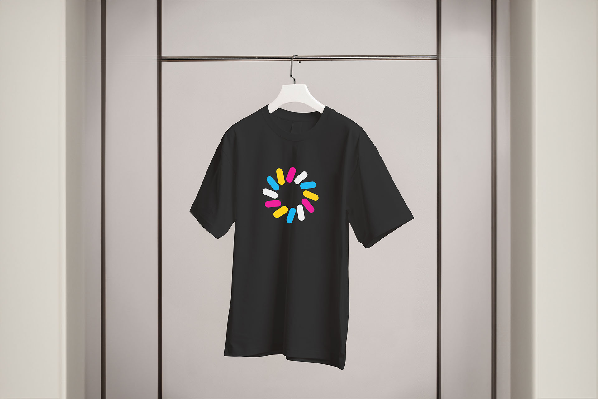
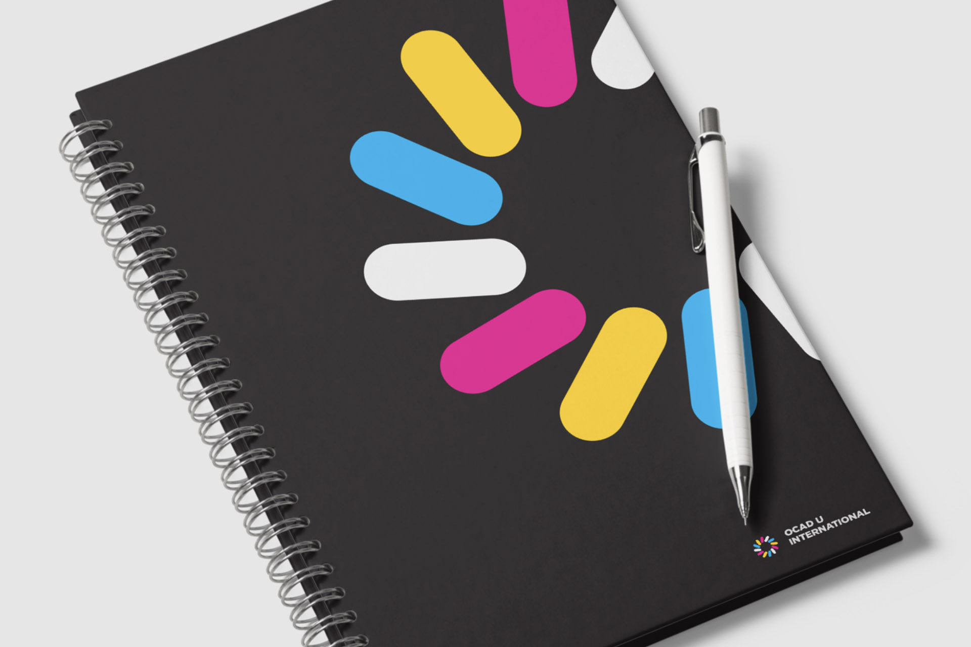
To brand the OCAD U International teams as one, a modular logo system was developed, formed of circular-capped lines (CCLs). The logo that represents the umbrella-group, termed “OCAD U International” is represented by a slanted-circular-formation of the CCLs. This simple formation, conveys the sense of unity and acceptance, as well as a welcoming factor.
Modular Form: Diveristy and Modularity
The modular form of CCLs allowed us to craft unique icon-logos for each OCADU International team. These icons were created by overlapping and arranging the elements, showcasing both unity and distinction. This design choice aimed to minimize confusion and provide visual clarity, empowering students to recognize the teams effortlessly.
Design Principles
Symmetry
Symmetry renders a seamless form that conveys qualities such as a welcoming and friendliness. it renders a sense of reliance, support and guidance for International students and their issues; and acceptance for everyone.
Radiation and Repetition
The slanted CCLs introduced a deliberate imbalance, which was counteracted by the repetition and radiation of elements. This balance symbolized the dependable support and assistance OCADU International offered to its students.
Movement
Dynamic movement within the logo captured the active spirit of the teams. It symbolized OCADU International's core areas—recruitment, exchange and support, and projects and partnerships—cohesively while maintaining their distinct functions.
Typography
The typography we employed was Gotham—a bold, modern typeface. Inspired by OCAD U's original branding by Bruce Mau Design, this choice established a seamless connection between OCADU International and OCAD U.
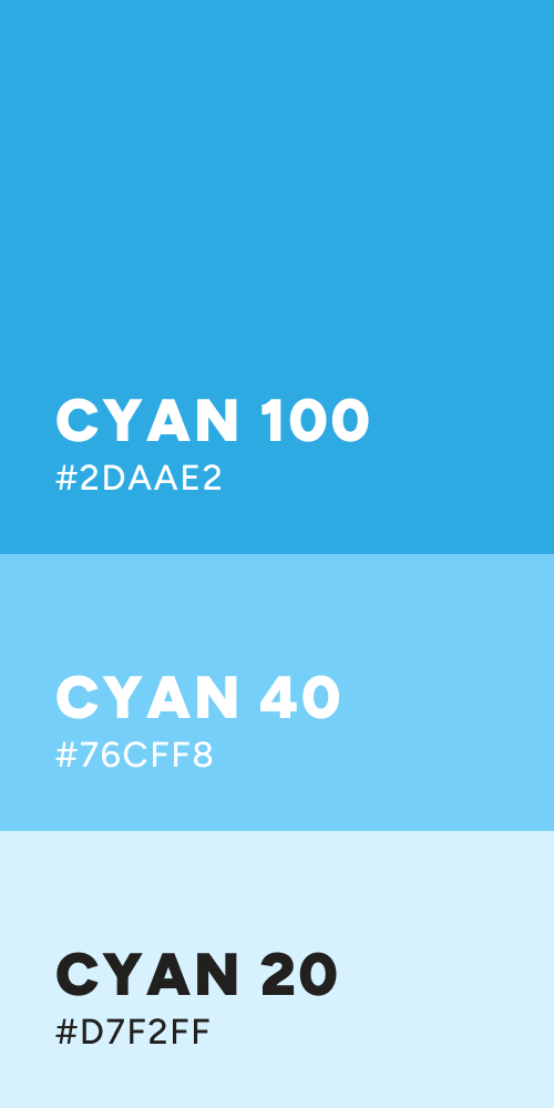
Colors
The color scheme drew from OCAD U's existing palette while injecting a vibrant twist. This allowed the OCADU International Logo System to harmonize with the main OCAD U logo while asserting its own identity.
Outcomes and Logo in Use
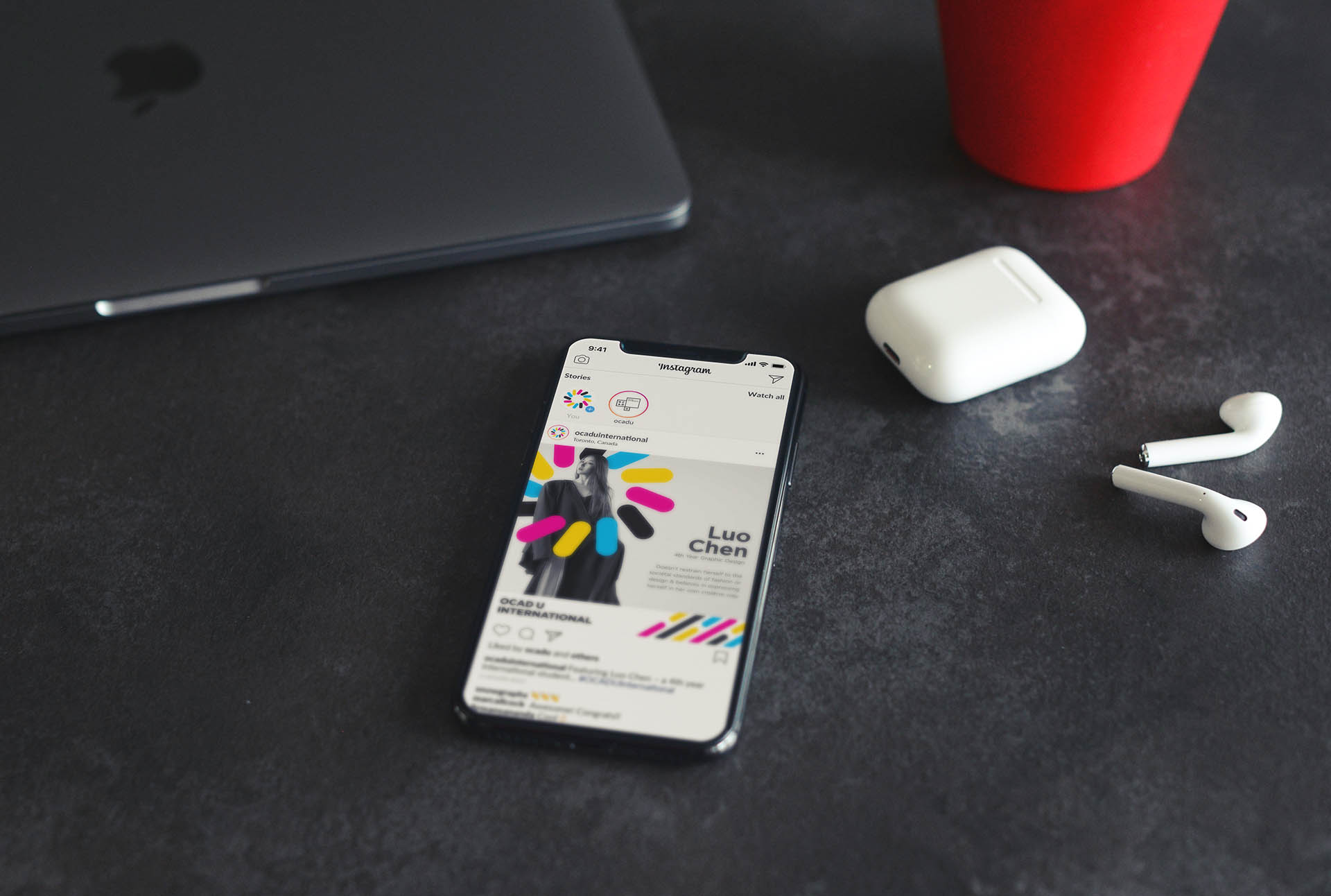
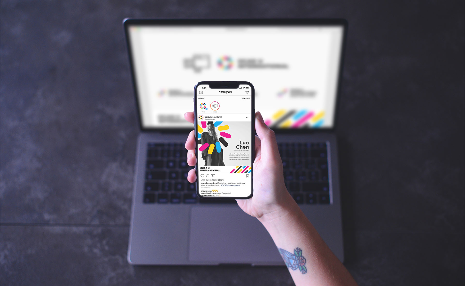
My design solution transformed the student experience at OCAD University. The modular logo system eliminated confusion and increased the efficiency of query handling. Students now easily identify and connect with each team, resulting in timely and accurate responses to their inquiries.
Ready to amplify your brand's impact?
Let's talk!
Craft a brand strategy that leaves an enduring impact, just like OCAD U International's design that stole the spotlight, and solved problems.