Project Brief
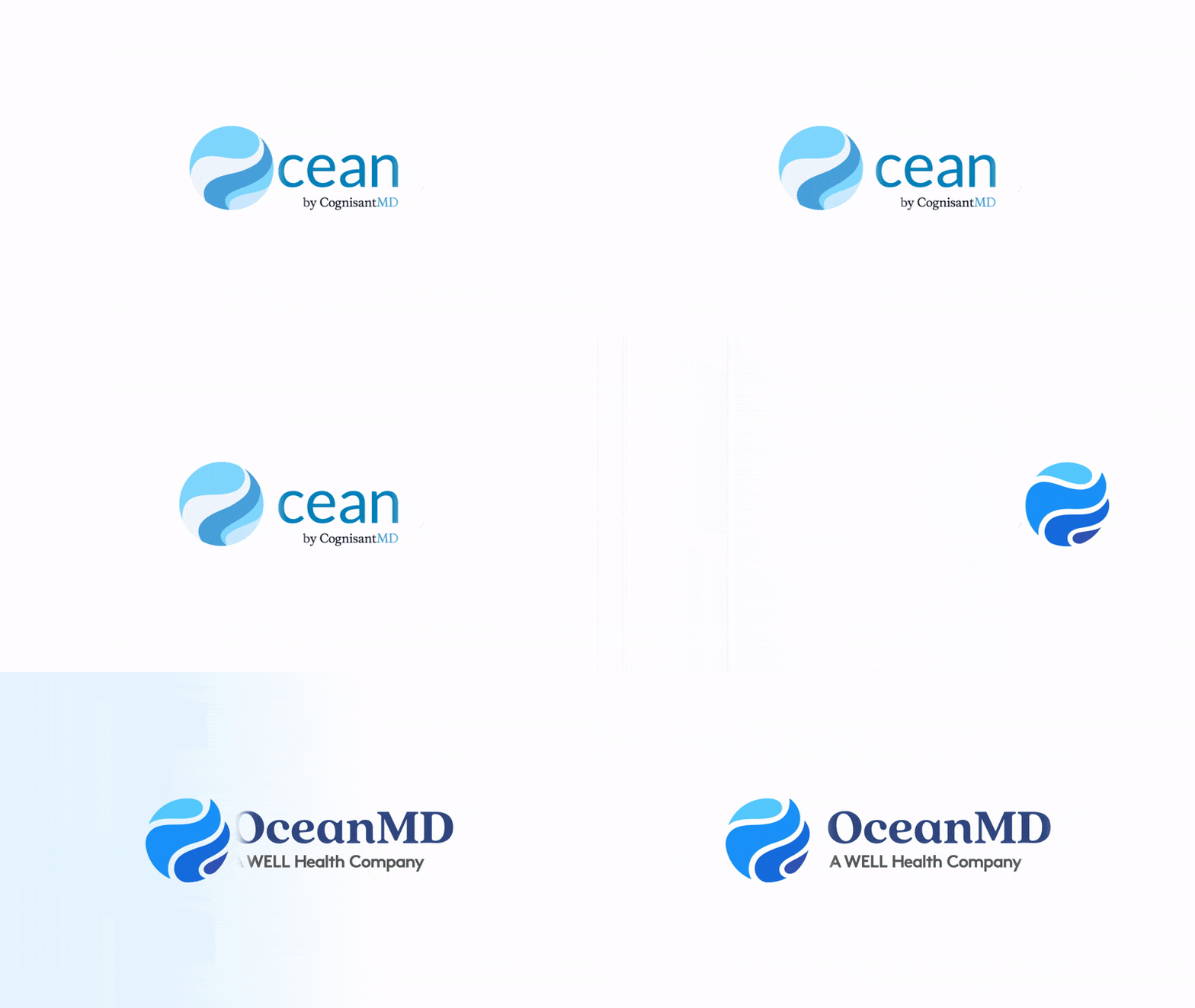
In 2023, OceanMD, formerly CognisantMD, hit a critical phase due to substantial changes like its acquisition by WellHealth Technologies, requiring a brand overhaul as the old identity no longer matched the brand's growth.
The old branding felt restrictive and outdated, failing to capture OceanMD's modern, customer-centric essence. Its complexity also hindered accessibility, a key aspect in the diverse digital landscape.
Employer
OceanMD
Role
Graphic Designer
Year
2021 – 2023
Collaborators
Kamilah Carter, Frank Butty, Melissa Lee

Award of Merit – 2024 RGD In-House Design Awards
This project received the Award of Merit (awarded projects that received the highest scores across the judges) in the 2024 In-House Design Awards by The Association of Registered Graphic Designers (RGD).

Award of Merit – 2024 RGD In-House Design Awards
This project received the Award of Merit (awarded projects that received the highest scores across the judges) in the 2024 In-House Design Awards by The Association of Registered Graphic Designers (RGD).
The Solution
In close collaboration with Creative Lead, Marketing Director, and VP of Business Operations, I played a central role in OceanMD's brand rebirth, guided by a deep understanding of the company's direction.
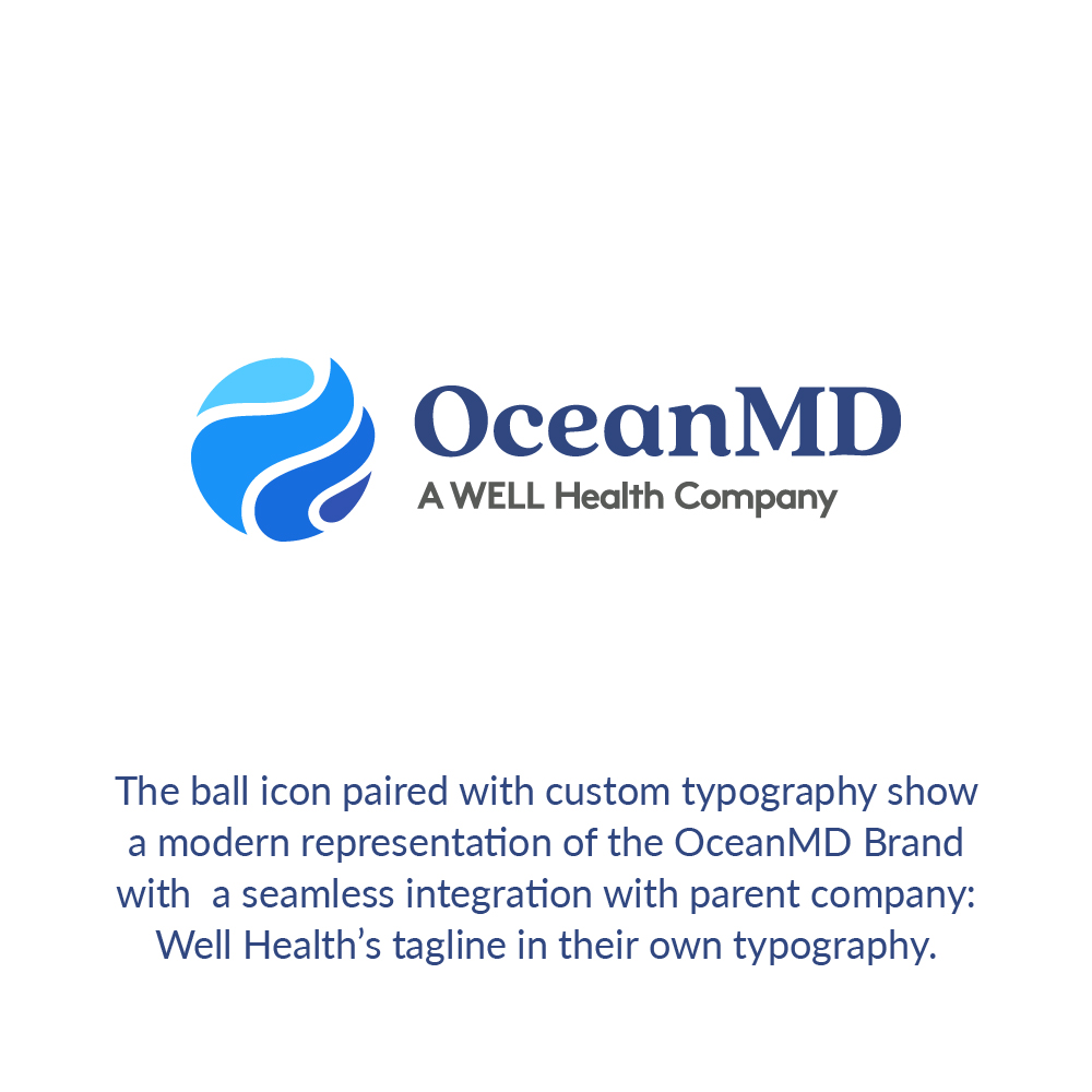
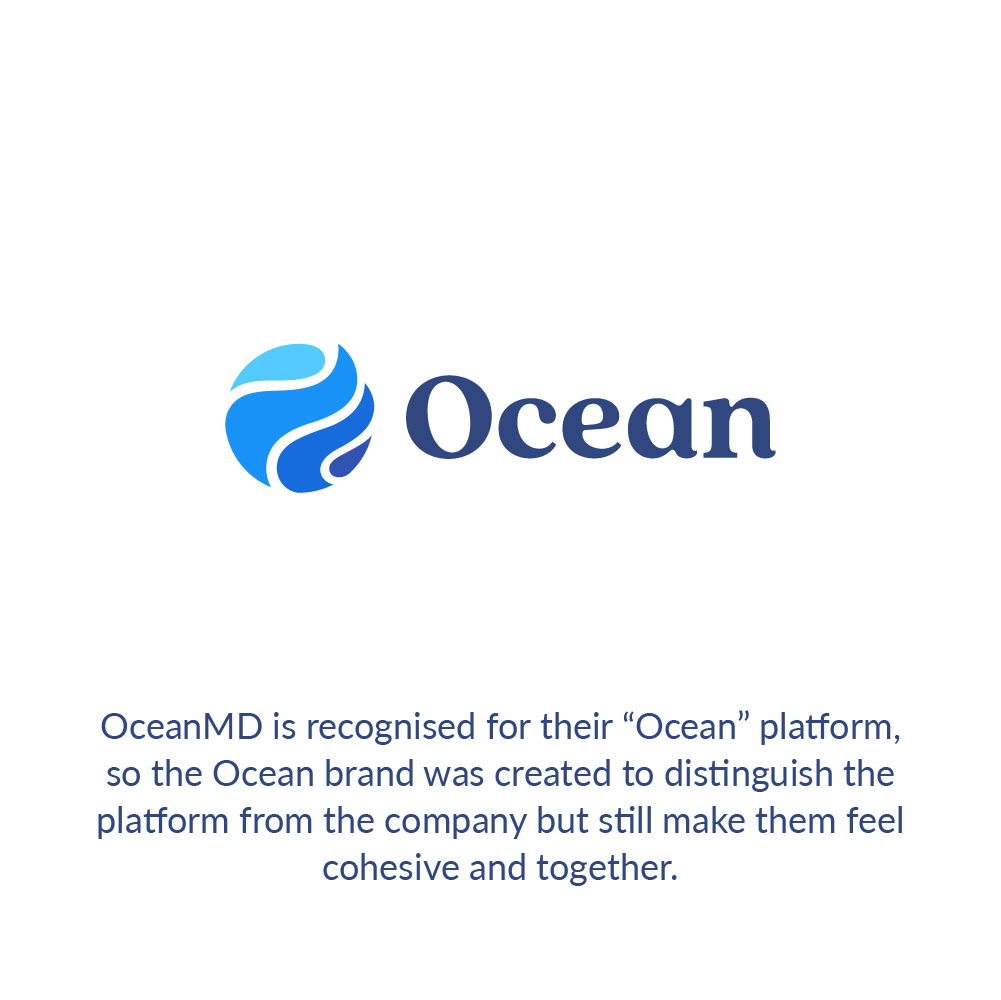
This involved crafting a new brand essence, identity, and messaging, including a strategic color palette for visual appeal and accessibility. We integrated these elements seamlessly across digital and print assets to create a cohesive and resonant brand image.
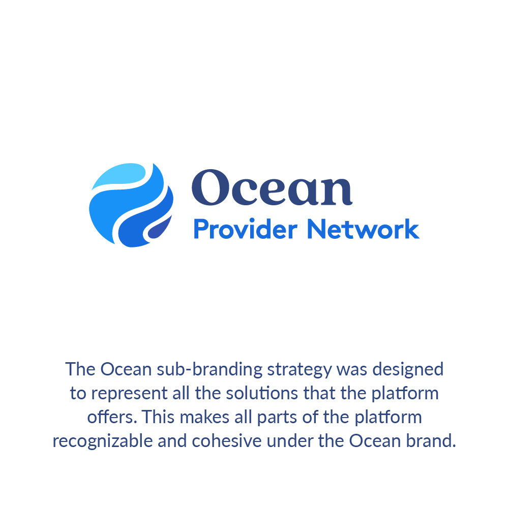


Rebrand Impact
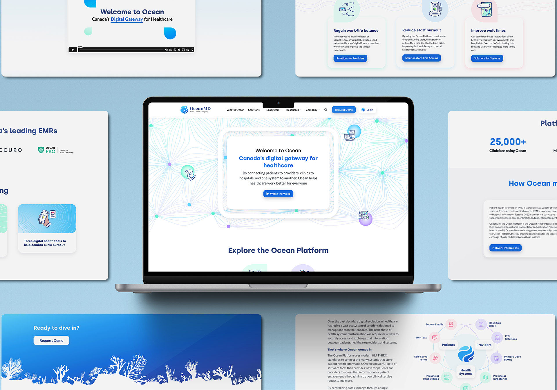
The rebrand had an immediate and far-reaching impact on OceanMD's trajectory. The revitalized visual identity, now imbued with accessible colors, resonated powerfully, drawing attention and engagement. The redesigned website emerged as a dynamic hub, seamlessly embodying OceanMD's renewed identity and delivering an immersive brand experience.
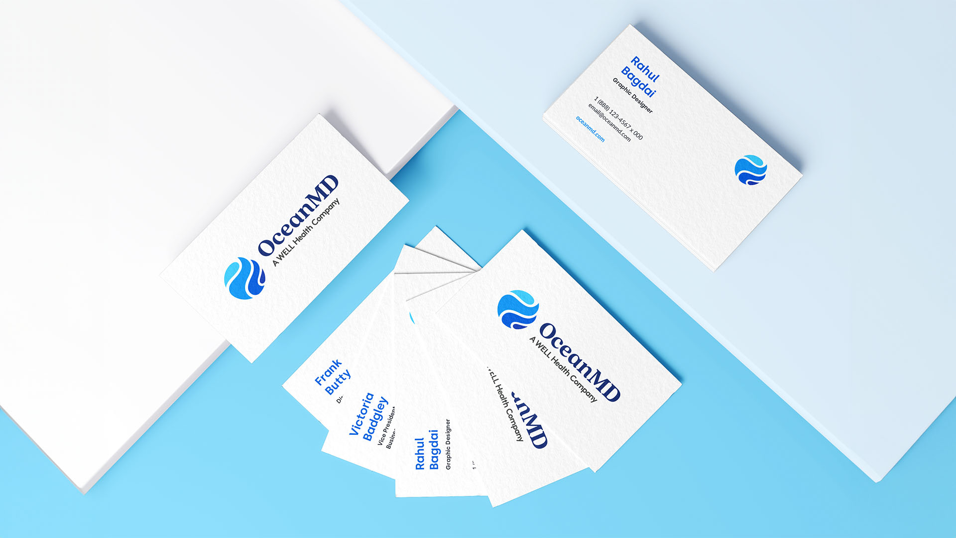

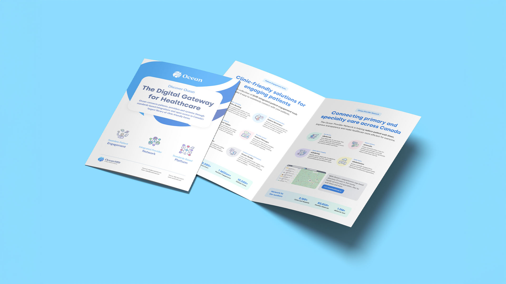
A Robust Website
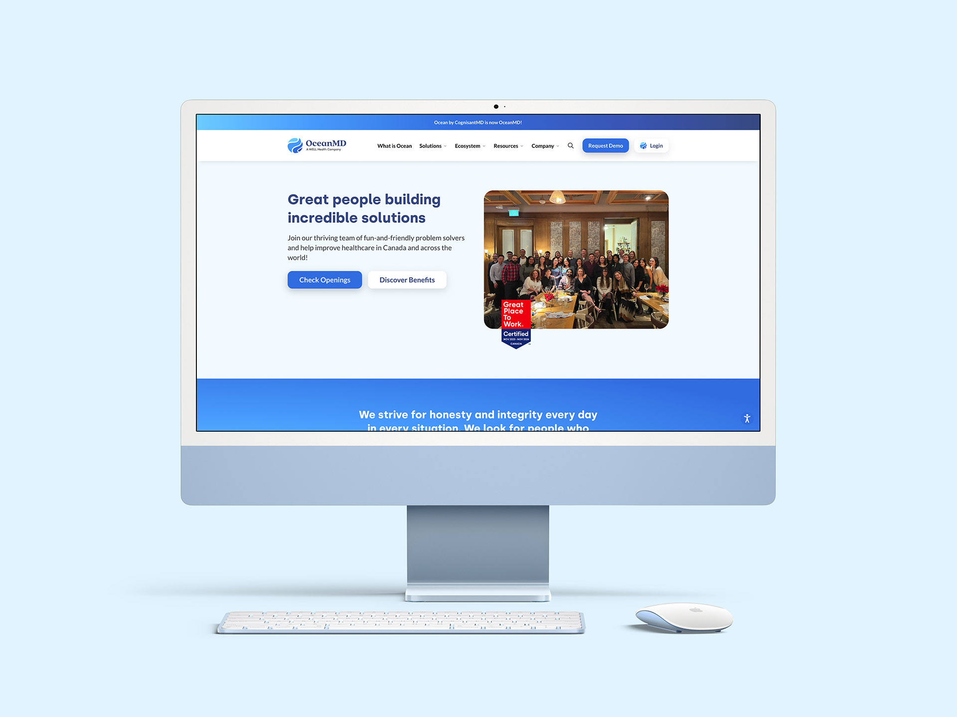
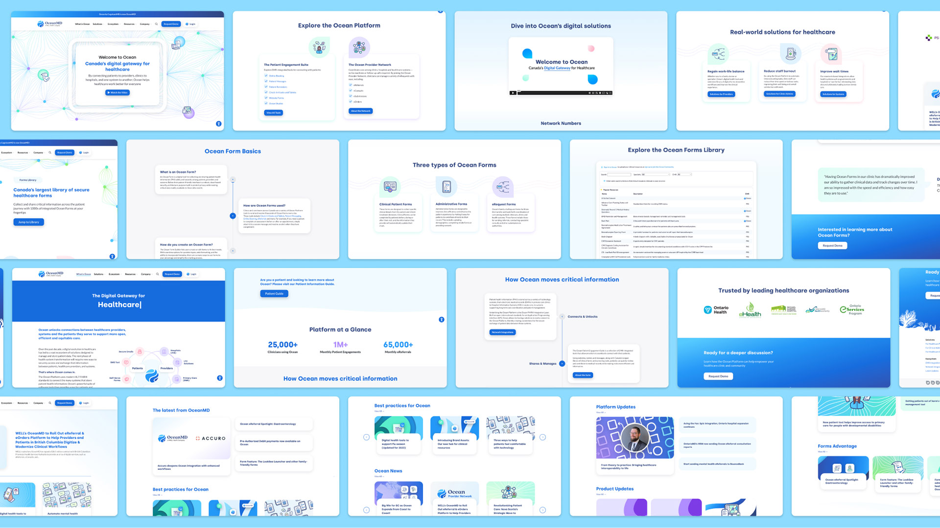
The OceanMD website seamlessly combines responsive design, cohesive branding, modular flexibility, and accessible content editing. Its responsive interface ensures a uniform experience across devices. The site integrates the brand's refresh, conveying professionalism.
Beyond aesthetics, it delivers a unified user experience, encouraging trust and engagement. Modular design allows easy content updates and feature integration as the brand evolves. A user-friendly content management system enables effortless content maintenance, ensuring relevance in the dynamic digital landscape. Overall, OceanMD's website effectively represents the brand while facilitating growth and engagement in the digital era.
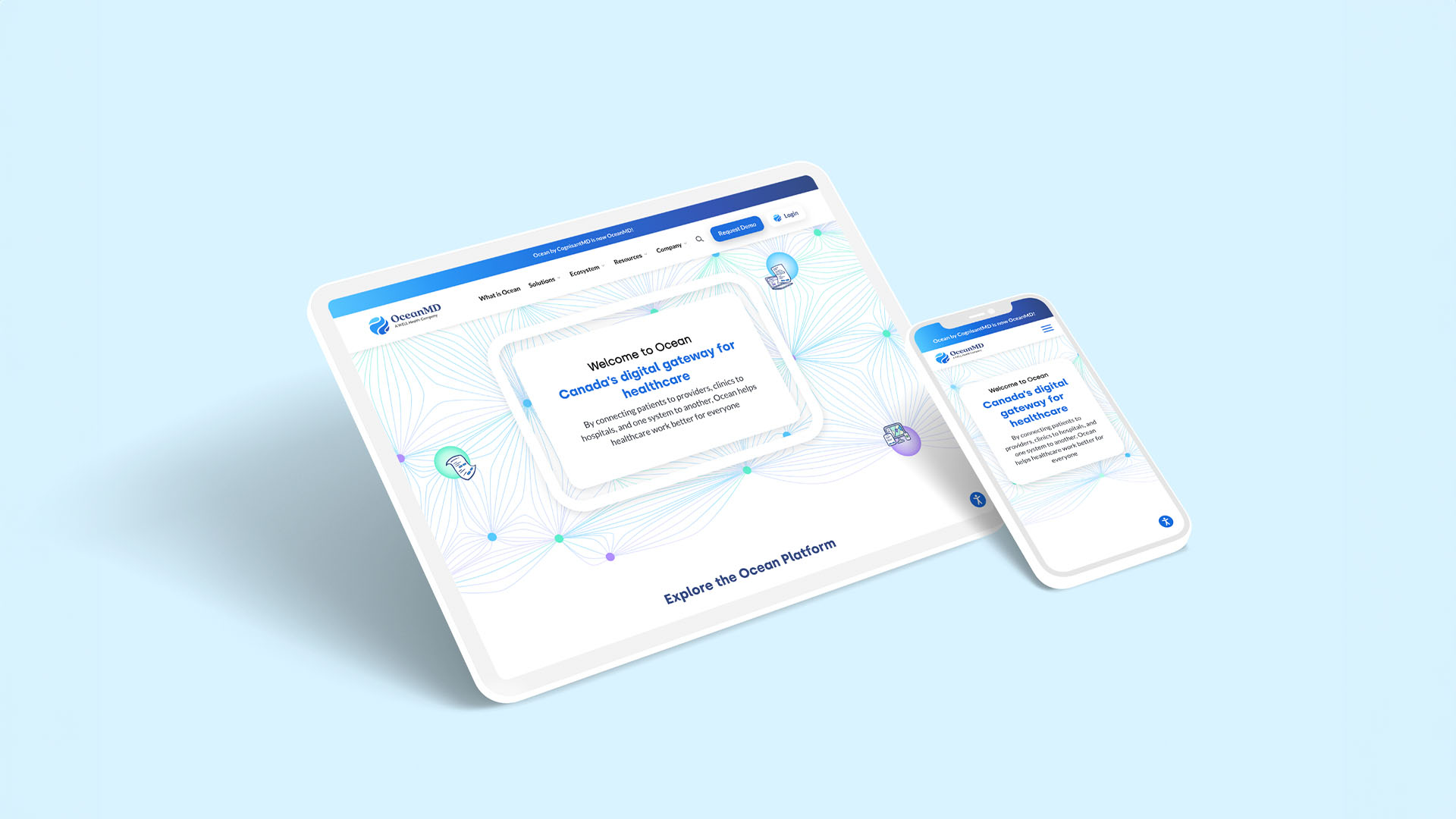
Responsive Design
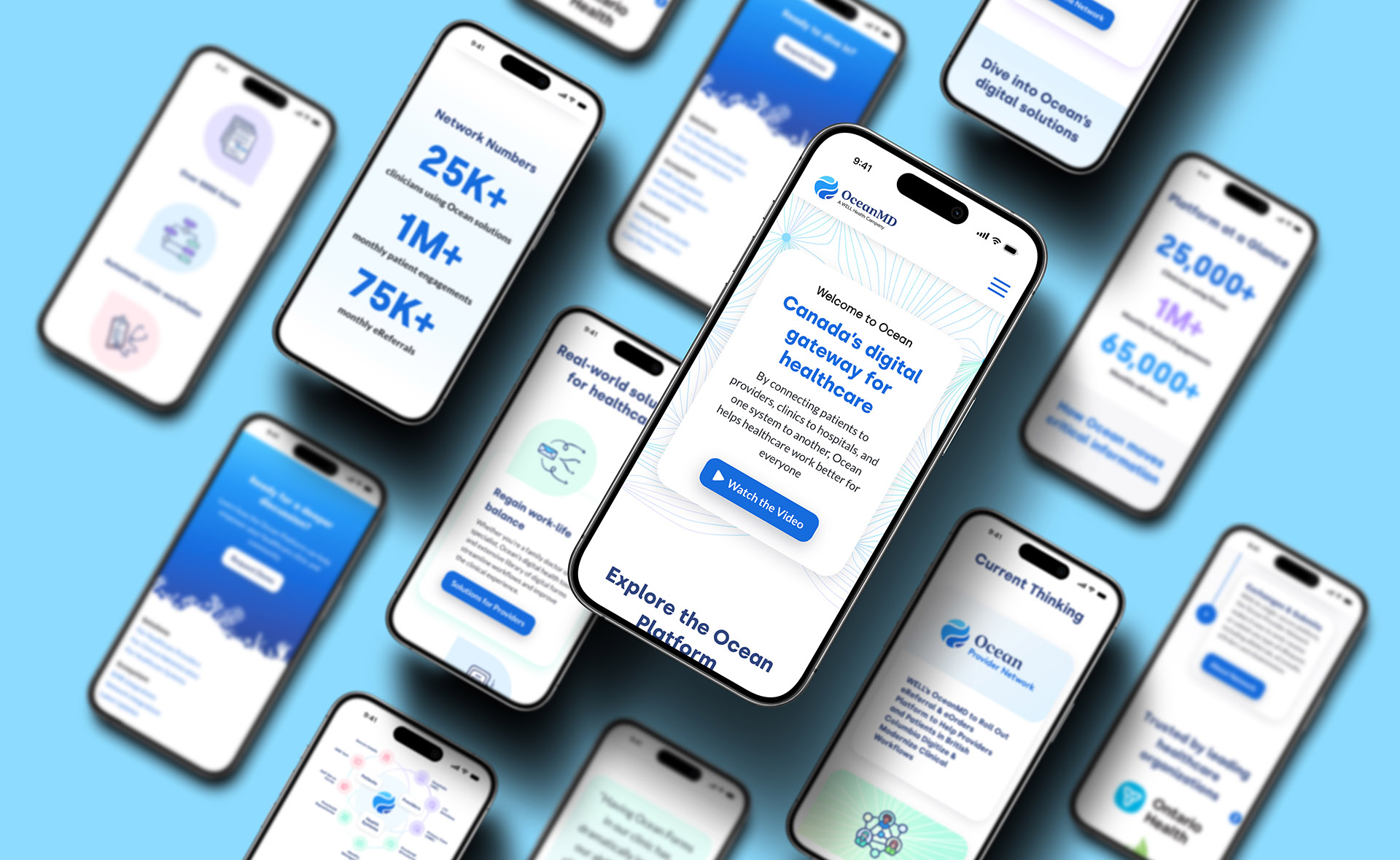
In today's connected world, website adaptability to diverse devices is paramount. OceanMD's meticulously crafted responsive design ensures consistent, engaging UX, boosting credibility and accessibility.
Cohesive User Experience
Cohesiveness goes beyond visuals, creating a holistic UX matching the brand values. The website embodies this, curating each element to resonate with the brand's messaging, fostering deeper visitor engagement.
Strategic Brand Integration
Every detail on the OceanMD website, from pixels to colors and elements, harmoniously reflects the renewed brand identity. This consistency promotes recognition, trust, and professionalism.
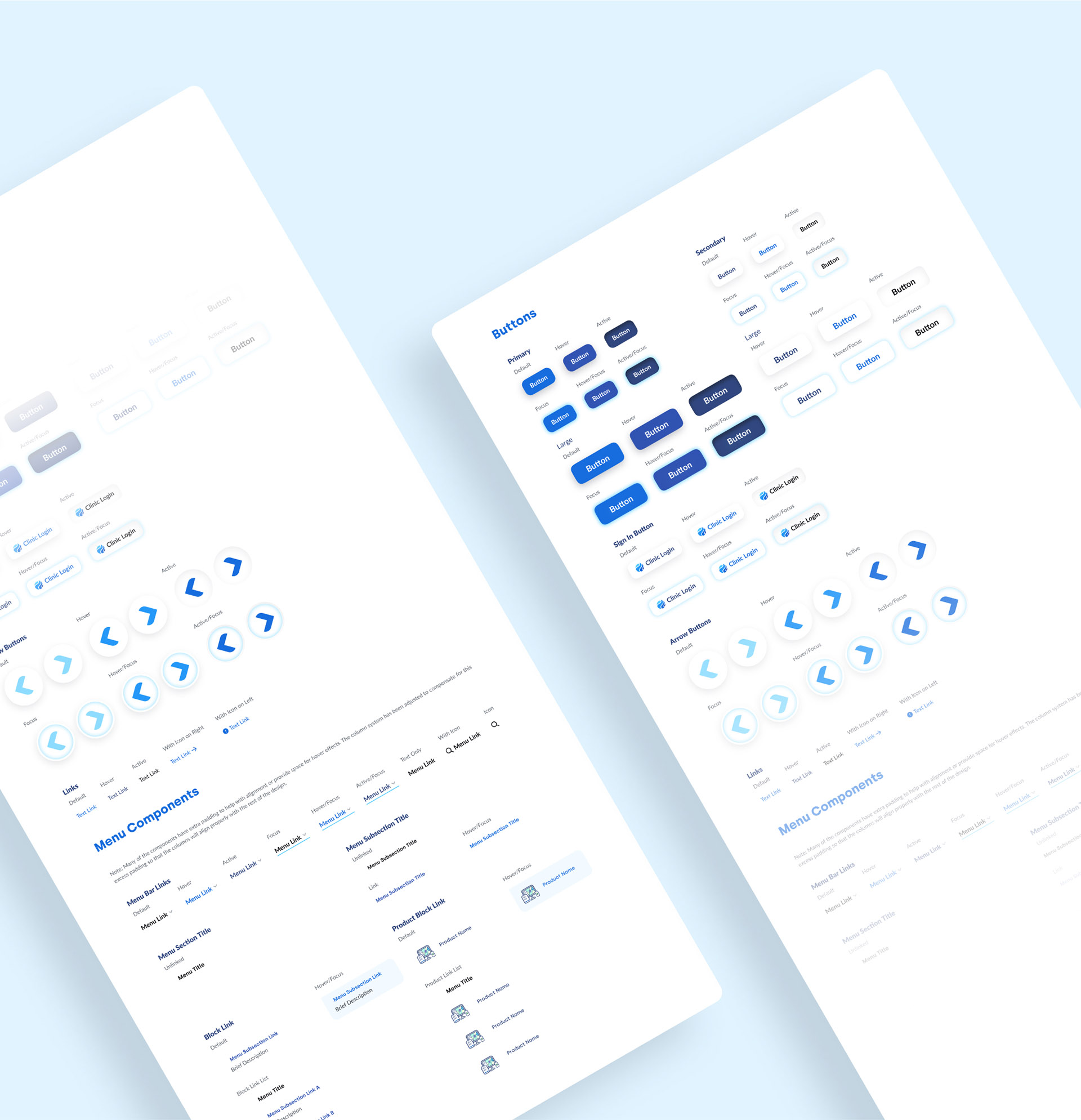
Modular Backend Blocks
The website's modular design enables easy scalability and adaptability. With this, it can enable swift content updates, feature additions, and brand changes, keeping OceanMD agile.
Website Accessibility Widget
The OceanMD website provides a user-friendly accessibility tools that allow anyone to customize website viewing experience. This democratization of access to information, making it available to anyone with or without a disability.
Typography
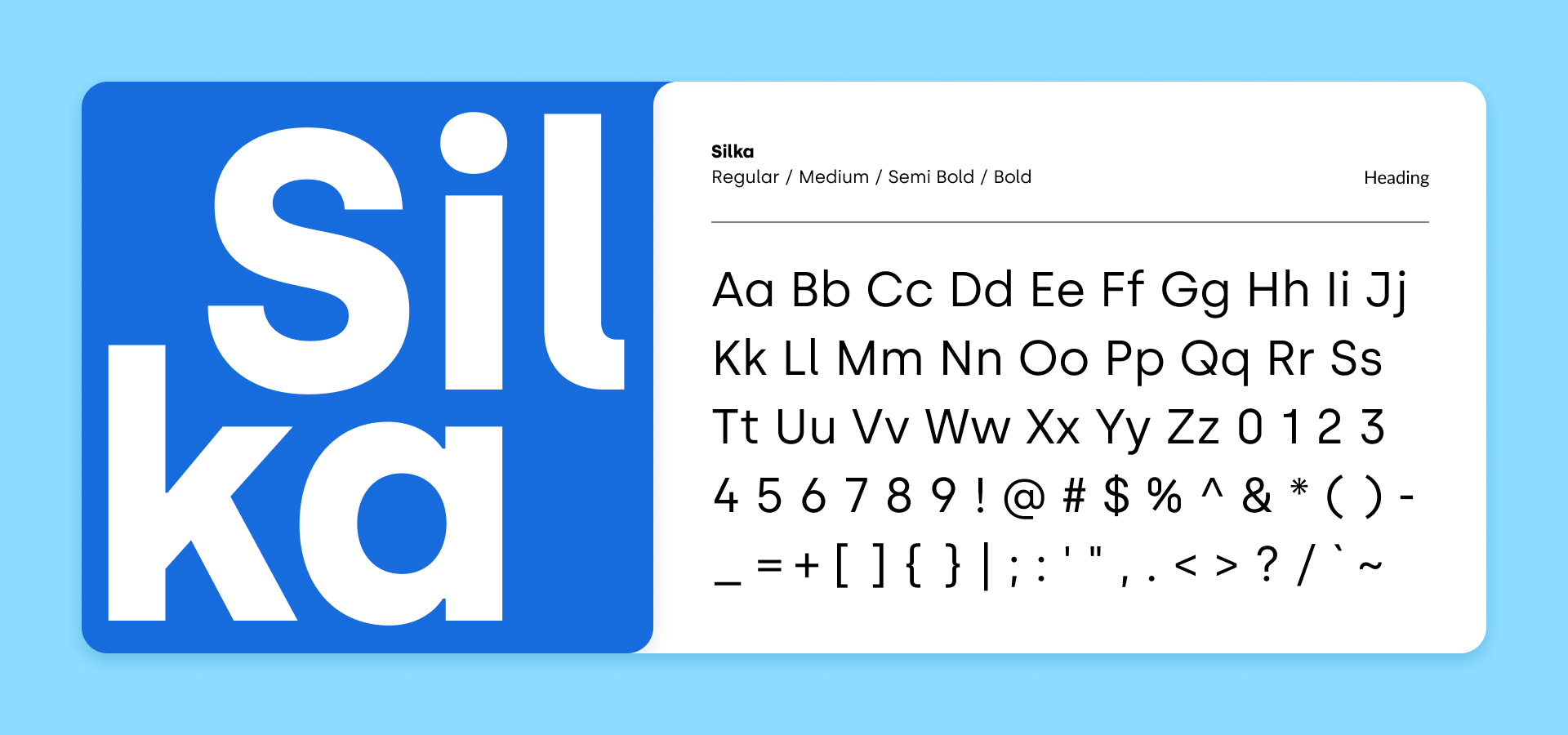
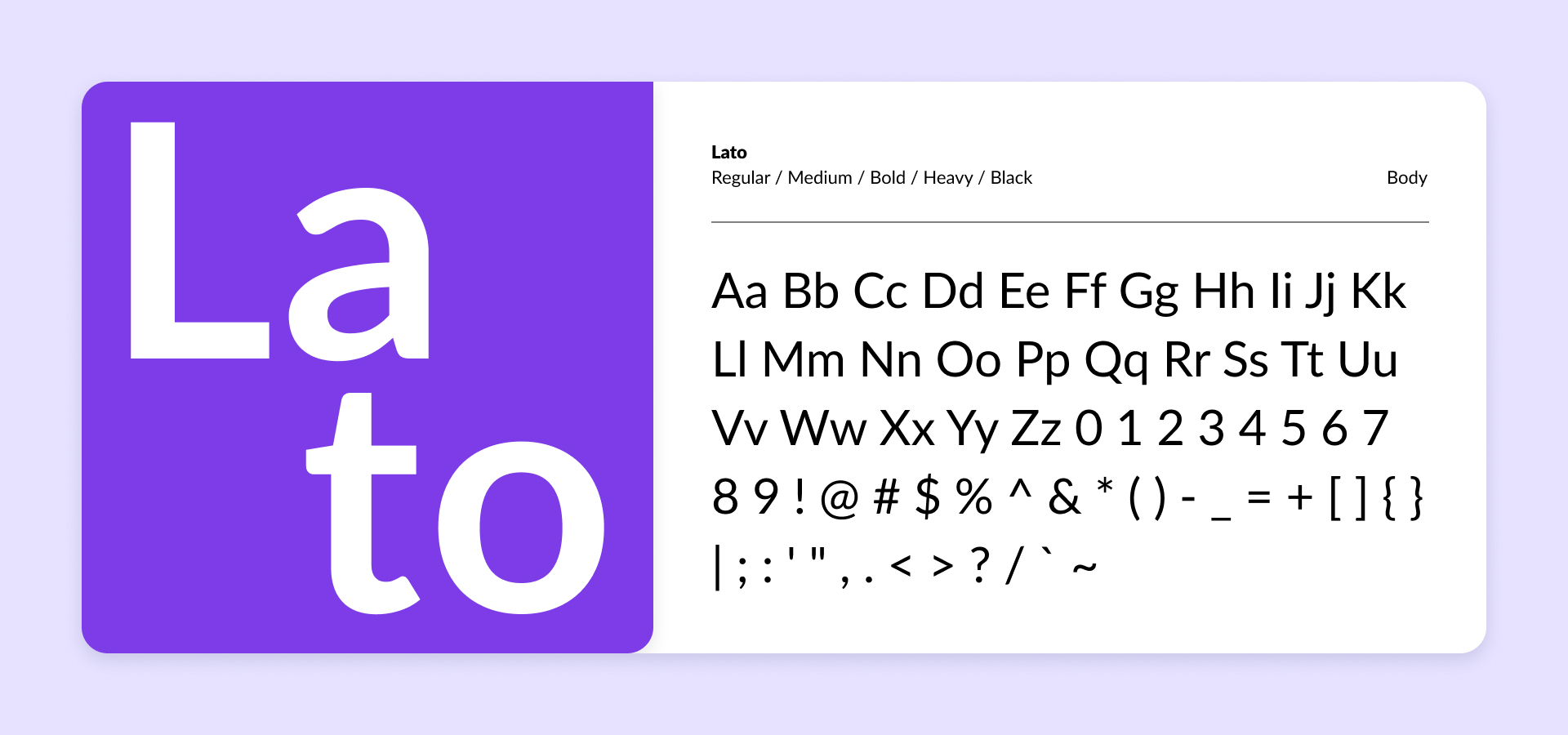
OceanMD's typography strategy blends Silka, a distinctive geometric typeface with unique, round letterforms for headings, enhancing the brand's flowy design. Complementing this is Lato, a tried-and-true font from the previous branding, known for its readability, modernity, and open-source accessibility.
Silka adds a touch of individuality to headings, while Lato continues to serve as the reliable main body font, ensuring the brand's message is conveyed with clarity and accessibility. This combination embodies OceanMD's commitment to a harmonious balance of uniqueness and readability.
Colors
The evolution of OceanMD's color palette, transitioning from teals to deep sea blues, marked a pivotal shift in OceanMD's rebranding journey. The previous teal-dominated scheme, while visually appealing, raised concerns about readability and accessibility. In response, we introduced a range of deep sea blues, meticulously calculated for optimal color contrast to ensure a more accessible and user-friendly experience.
Hex: #176CDD
Contrast: 4.96:1
Hex: #176CDD
Contrast: 4.96:1
Hex: #176CDD
Contrast: 4.96:1
Hex: #176CDD
Contrast: 4.96:1
Hex: #176CDD
Contrast: 4.96:1
Hex: #176CDD Contrast: 4.96:1
Hex: #176CDD
Contrast: 4.96:1
Hex: #176CDD
Contrast: 4.96:1
Hex: #176CDD
Hex: #176CDD
Hex: #176CDD
Hex: #176CDD
Hex: #176CDD
Hex: #176CDD
Hex: #176CDD
Hex: #176CDD
Hex: #176CDD
Hex: #176CDD
These colors not only enhance readability, particularly for users with visual impairments, but also symbolize OceanMD's commitment to professionalism and inclusivity, enriching the brand's visual identity. This transformation reflects OceanMD's dedication to creating a digital environment that is both welcoming and informative to all.
Icon Sets
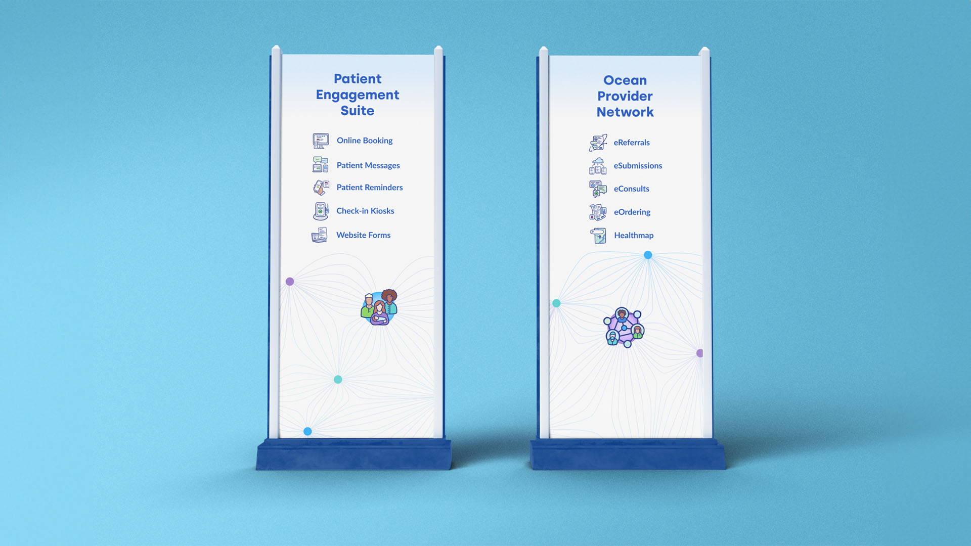
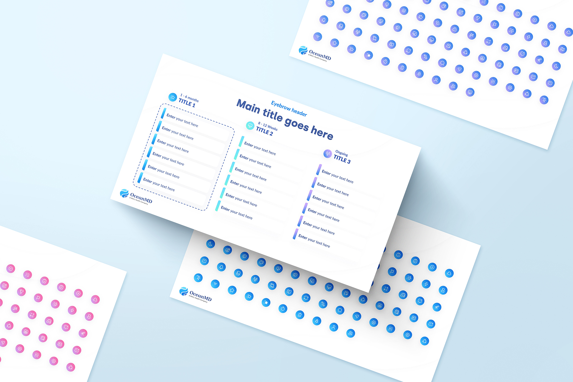
Ocean's products and platform found it challenging to fit in industry-generic icons. Our in-house illustrated Swashicons (icon set) helped represents products and their complex informational structures visually and clearly. The Swashicons set was combined with the open source Vuesax icons library to help us communicate non-product related complex concepts.
Presentation Design
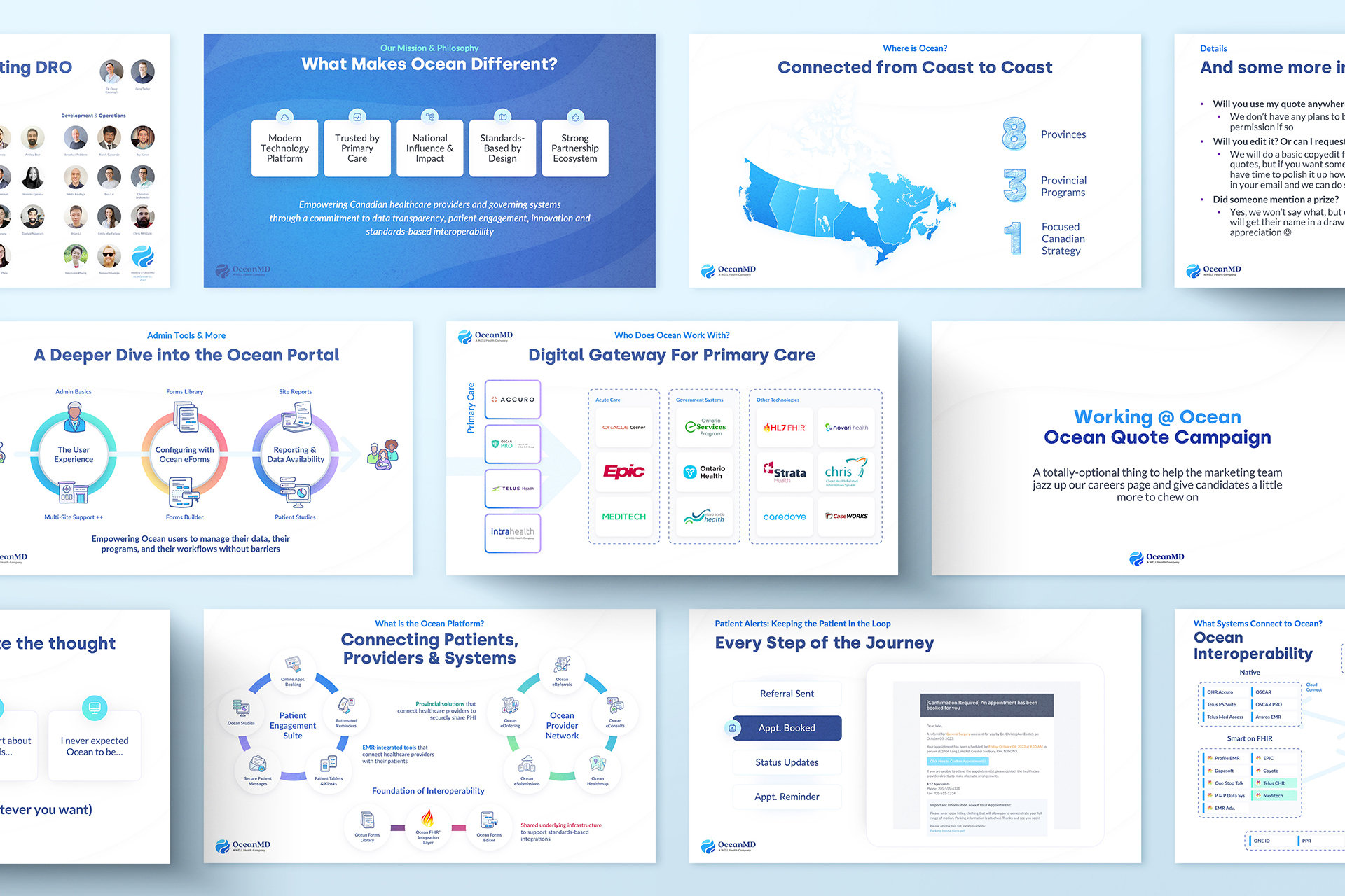
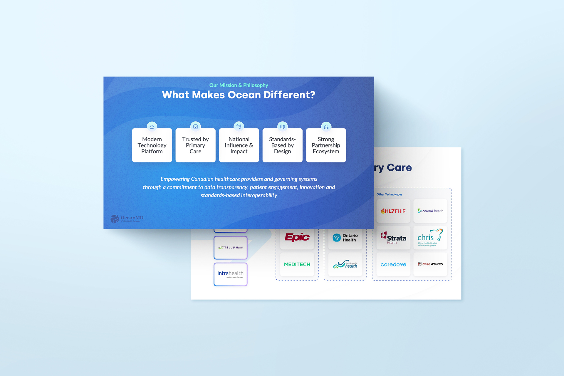
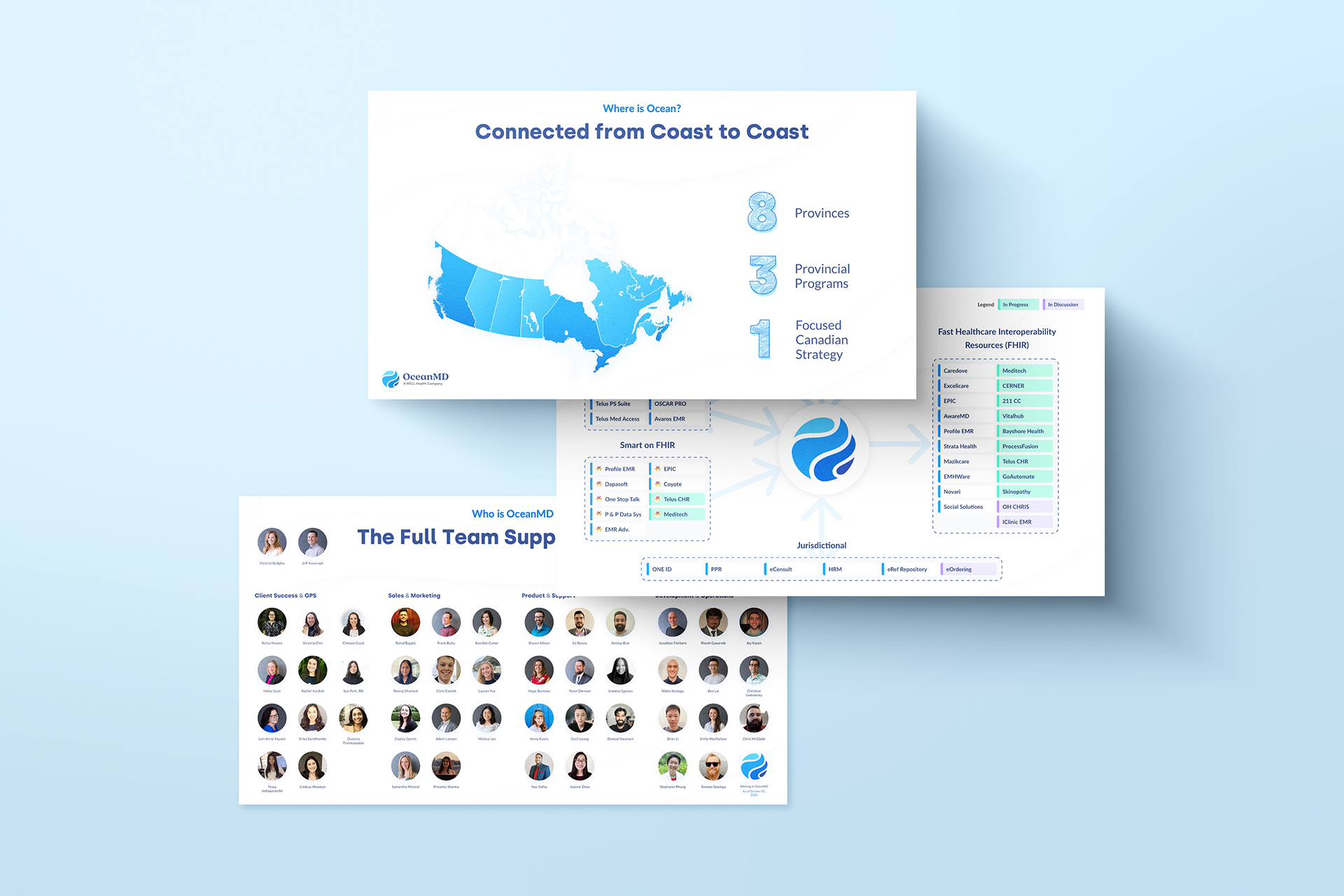
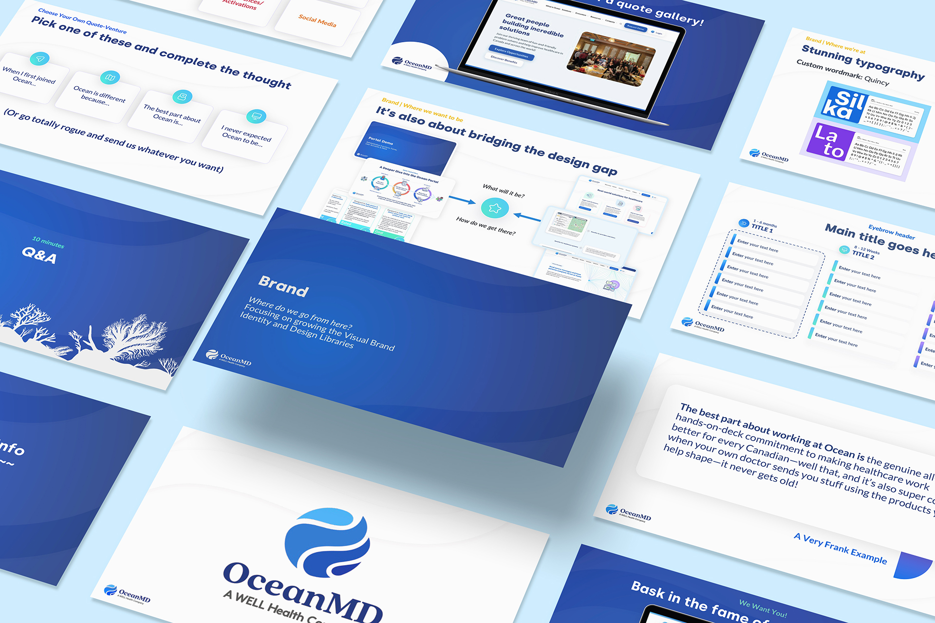
Ocean also required a brand new presentation deck that helped communicate complex informational structures such as integration diagrams, graphs, steps and more. Our in-house, all-editable and user-friendly presentation deck design made that possible.
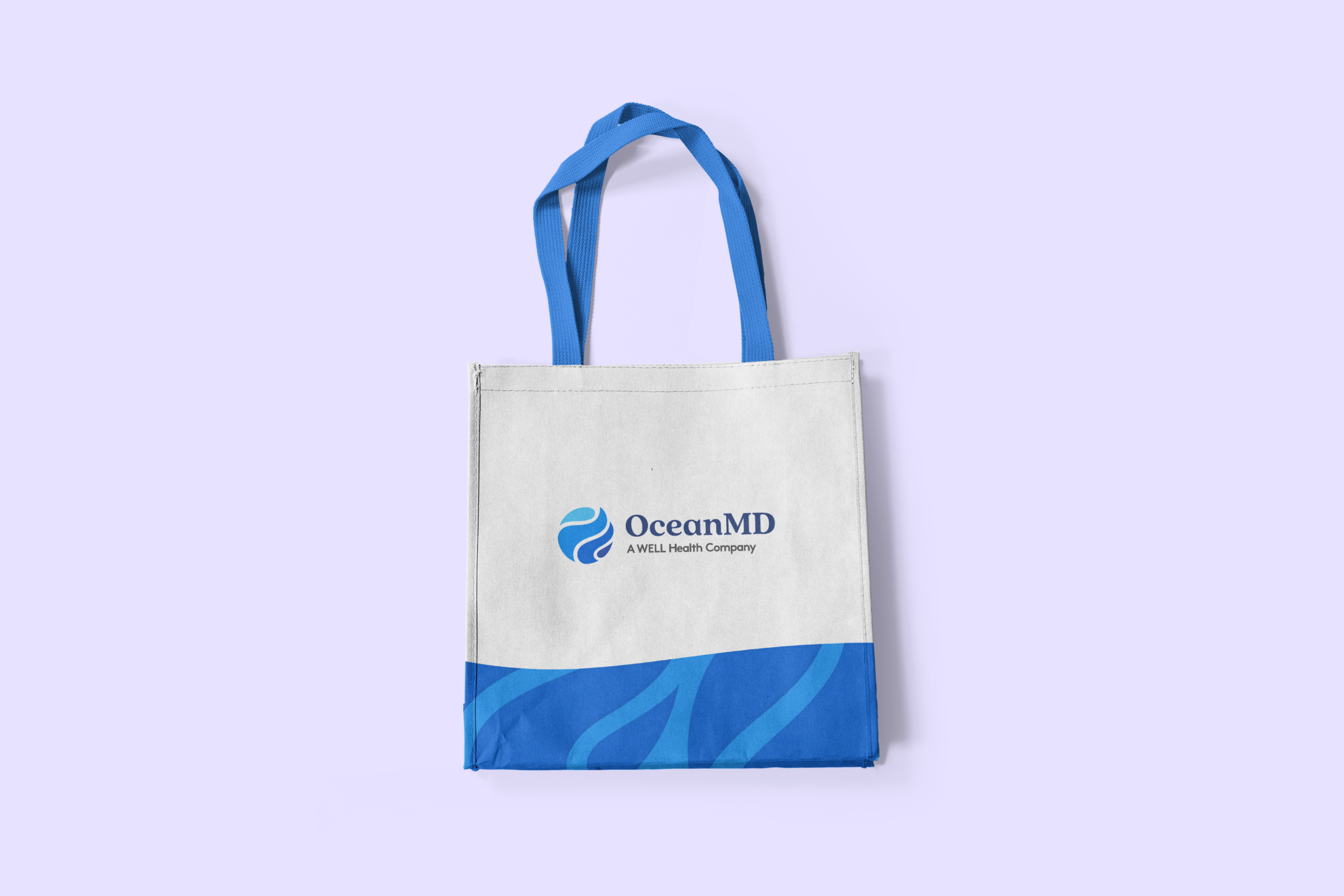
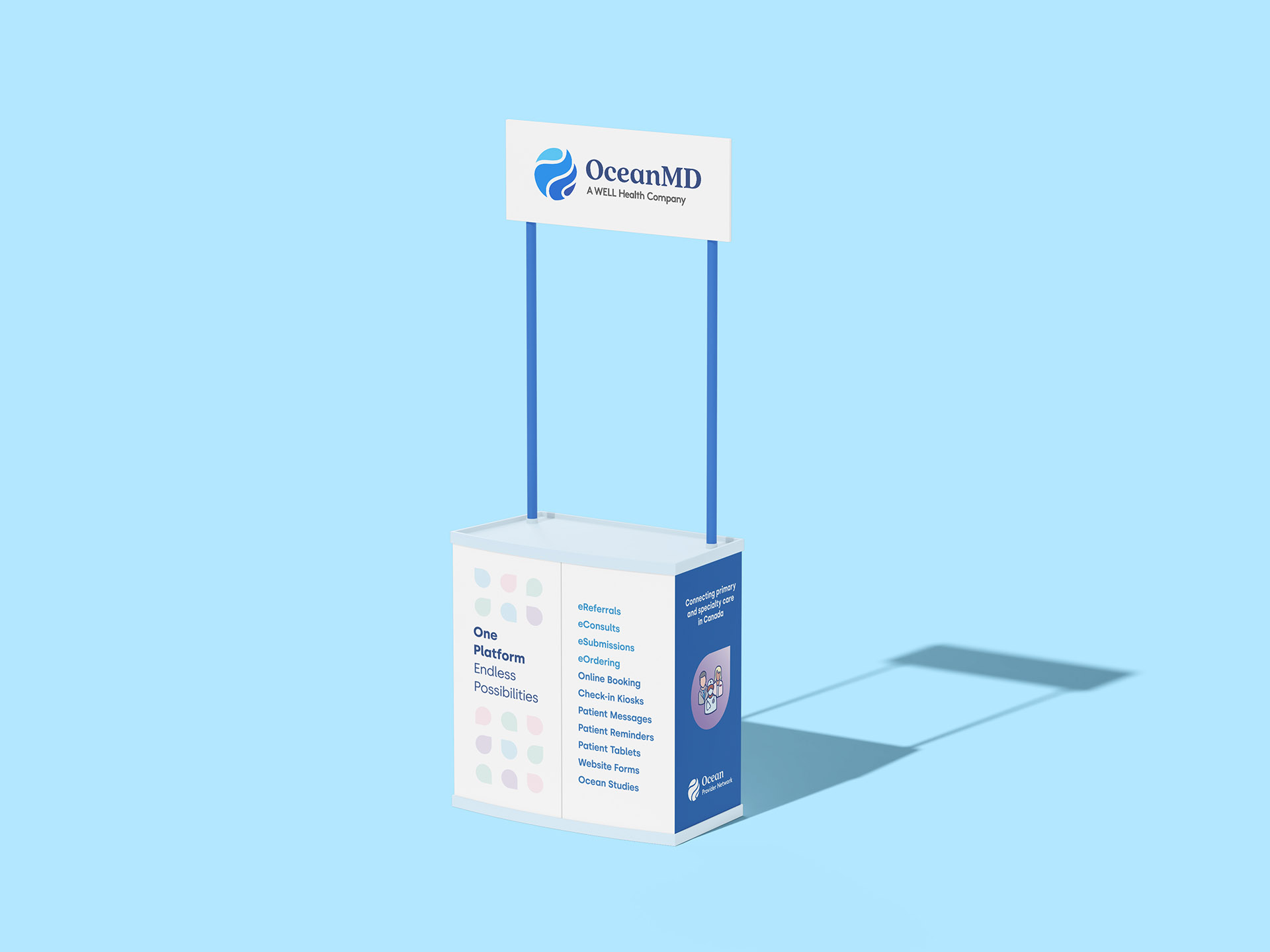
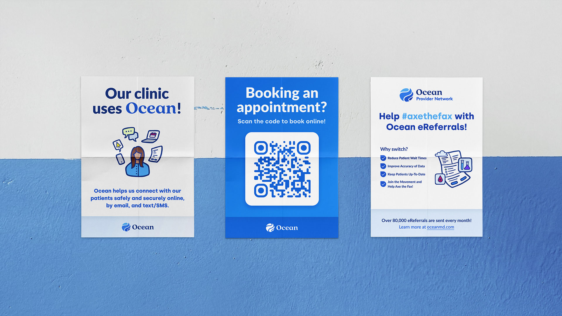
Impact:
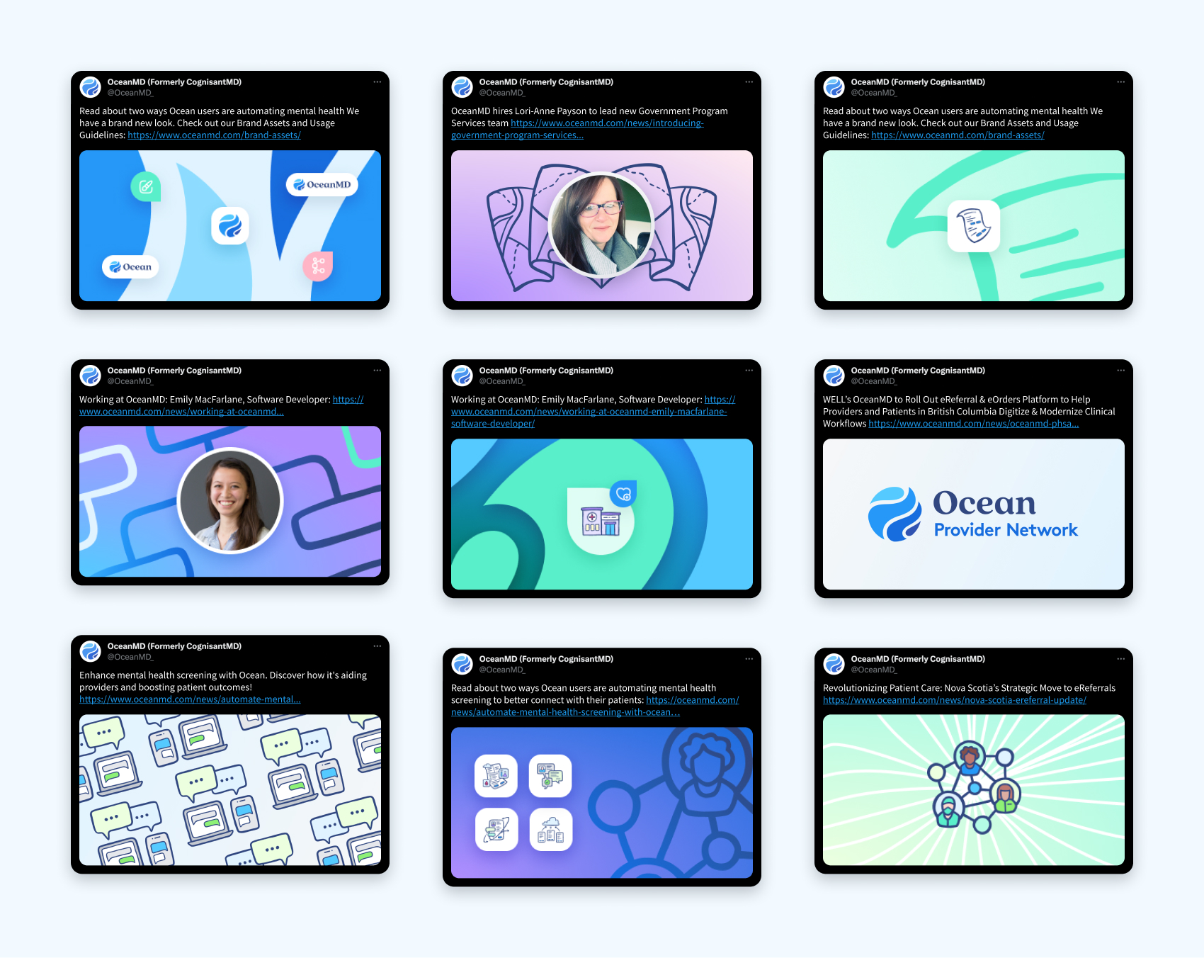
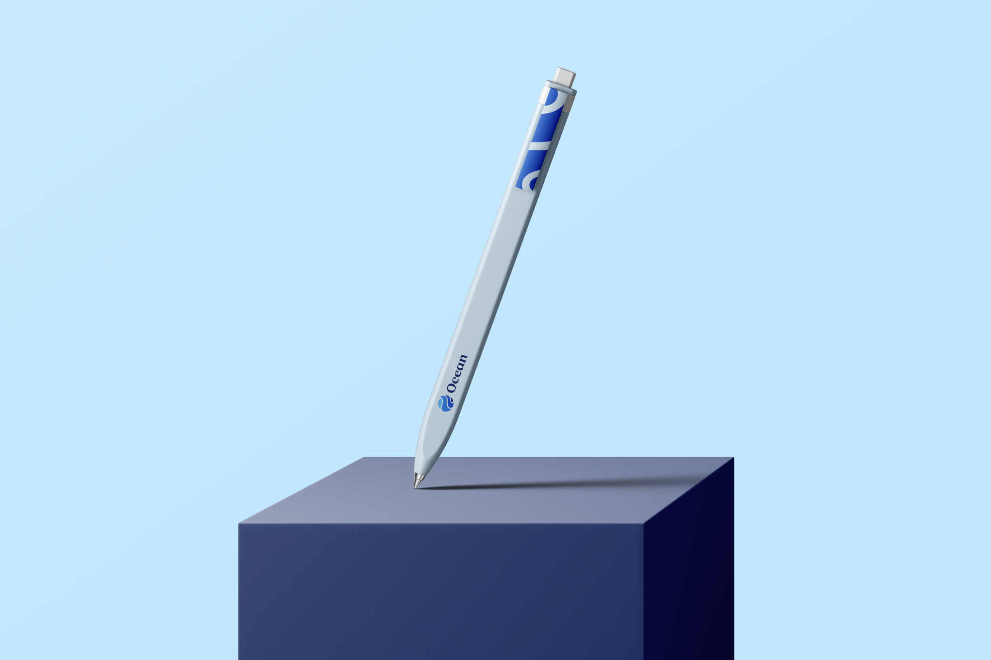
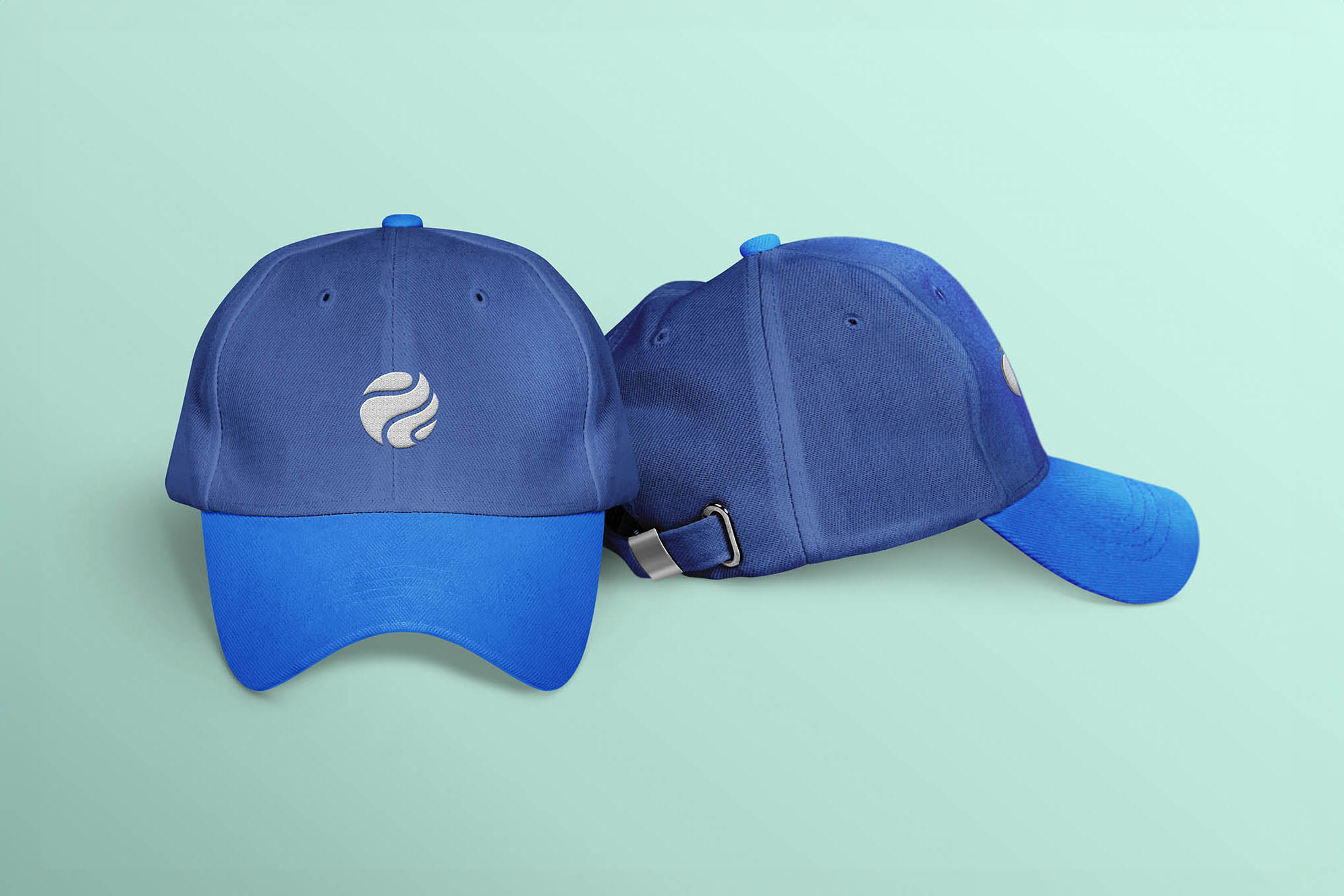
The rebrand reverberated across OceanMD's journey. All creative outcomes resonated effectively, capturing attention and fostering engagement. Everyone in the industry from clinics, and hospitals to trade show visitors were left stunned with Ocean's rebrand.
Learning:
This project underscored the symbiosis of creative intuition and strategic thinking. It magnified the value of collaboration, transparent communication, and an intimate understanding of the brand's story in crafting a successful rebrand.
Reflection:
The OceanMD rebrand stands as a testament to my capacity to infuse creativity with strategy, propelling meaningful brand evolution. It's also a testament to the dynamic influence of design to reimagine identities and catalyze positive market shifts.
Ready to elevate Your design game?
Let's talk!
Let's craft a branding strategy that leaves a lasting impression, just like OceanMD's rebrand became the talk of the town.
