Project Brief
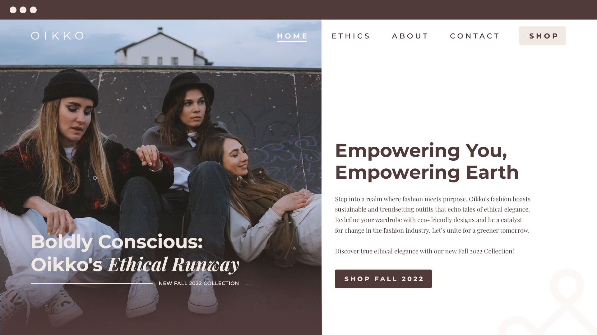
Oikko Social Apparels Co. aims to disrupt the fashion industry as a clean, ethical, and eco-friendly brand. Differentiating from fast fashion and greenwashing practices, they seek a visually distinct brand identity that communicates their commitment to sustainability, transparency, and slow, responsible fashion. Connecting with conscious consumers is vital while maintaining simplicity and authenticity. Oikko needed a skilled designer to create a cohesive and recognizable brand image that leaves a lasting impact, setting a new standard for ethical fashion.
Client
Oikko Social Apparels Co.
Role
Art Director,
Graphic Designer
Year
2022

The Solution
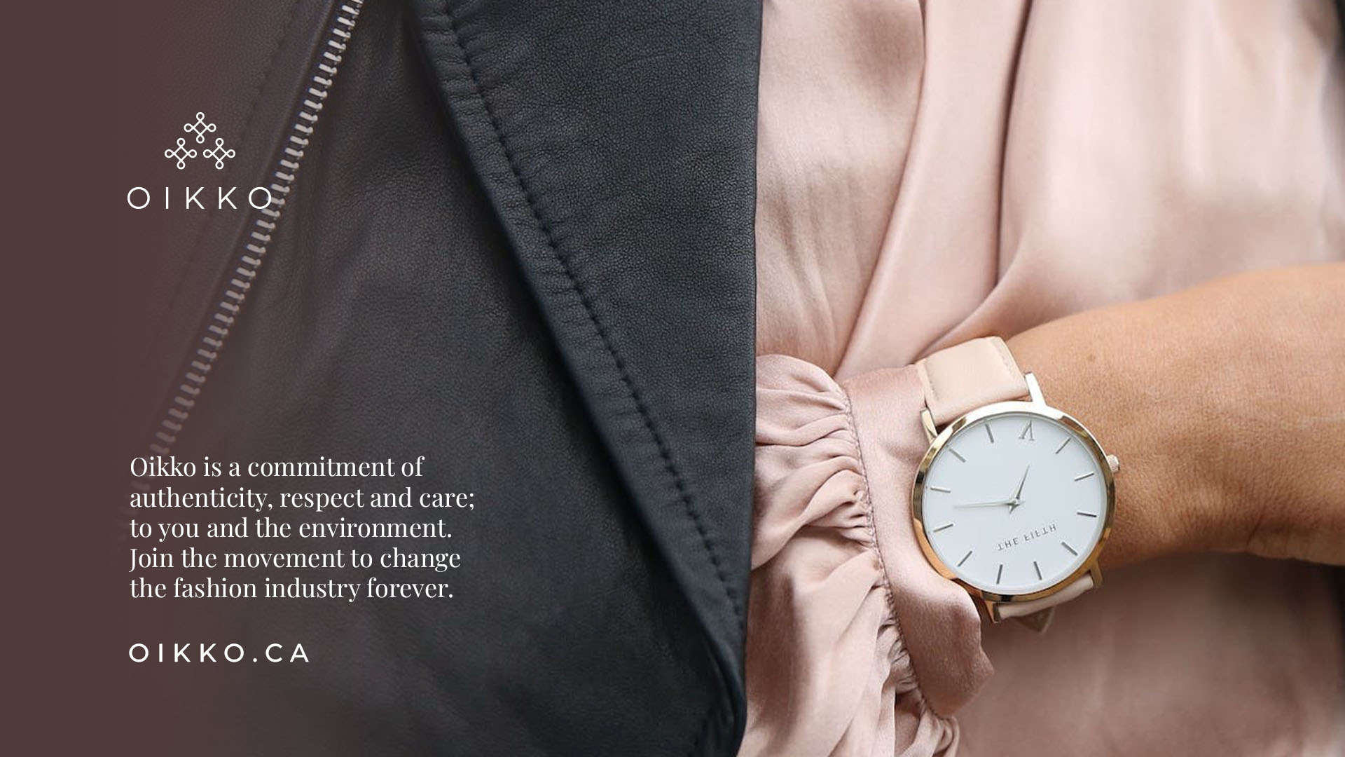
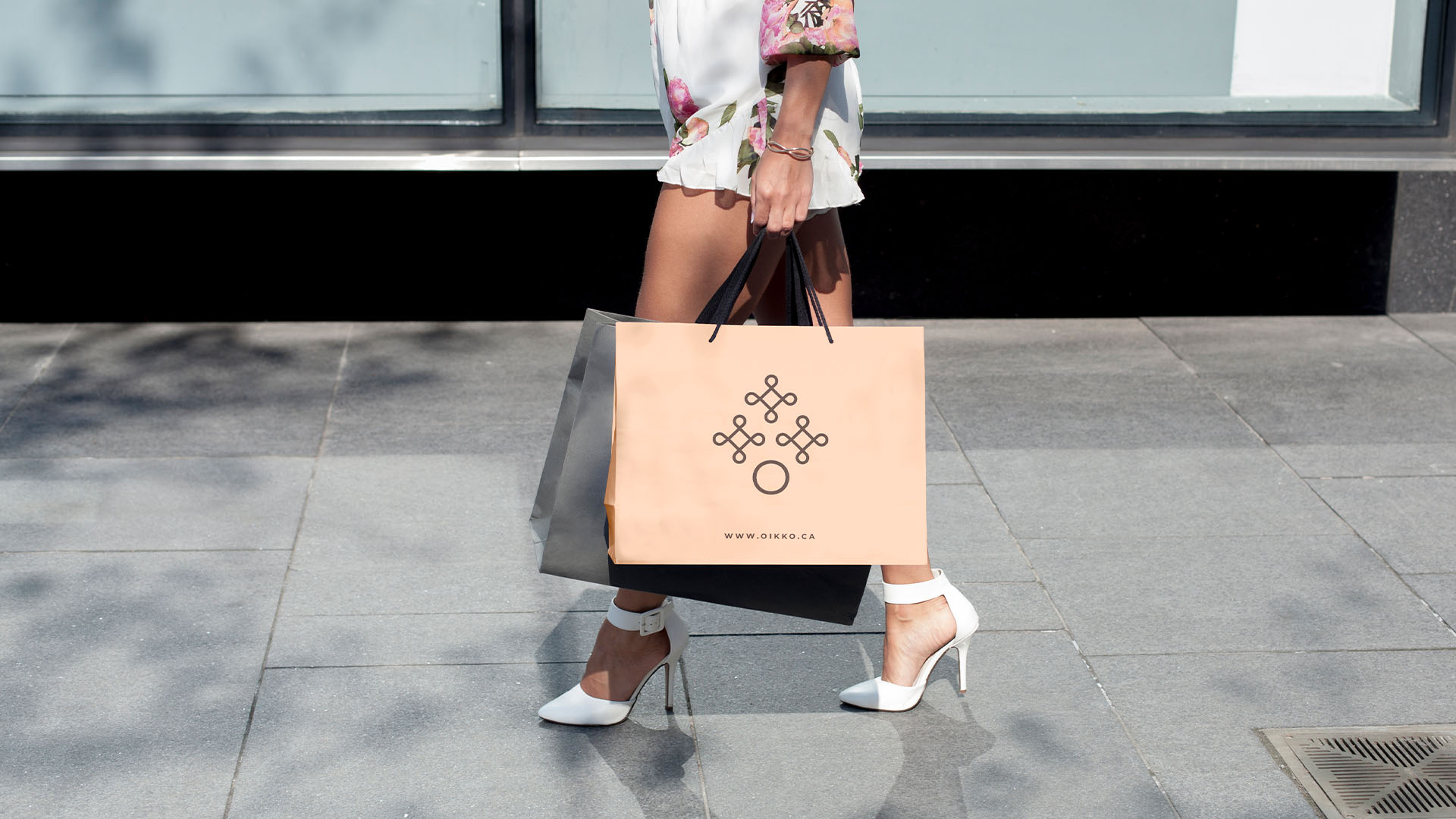
To tackle Oikko Social Apparels Co.'s challenges, I crafted a simple, clean, and distinctive brand identity. By utilizing minimalist design, I ensured a clear and trustworthy message in their visual language. The key solution was a modular brand identity, ensuring consistency across various sizes and applications, appealing to diverse audiences like Gen Z and Millennials, who value authenticity and purposeful design. The adaptable brand mark, serving as a combination mark, icon, and symbol, boosted memorability and reinforced Oikko's ethical and eco-friendly values in the fashion industry.
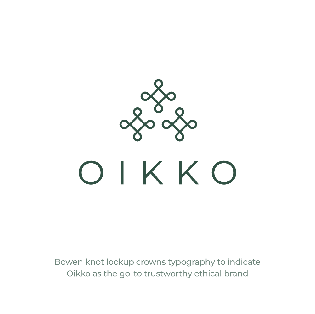
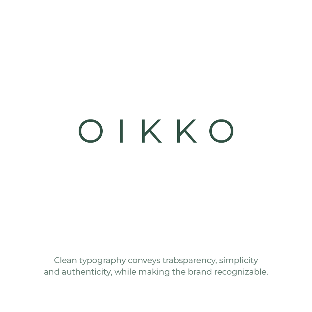
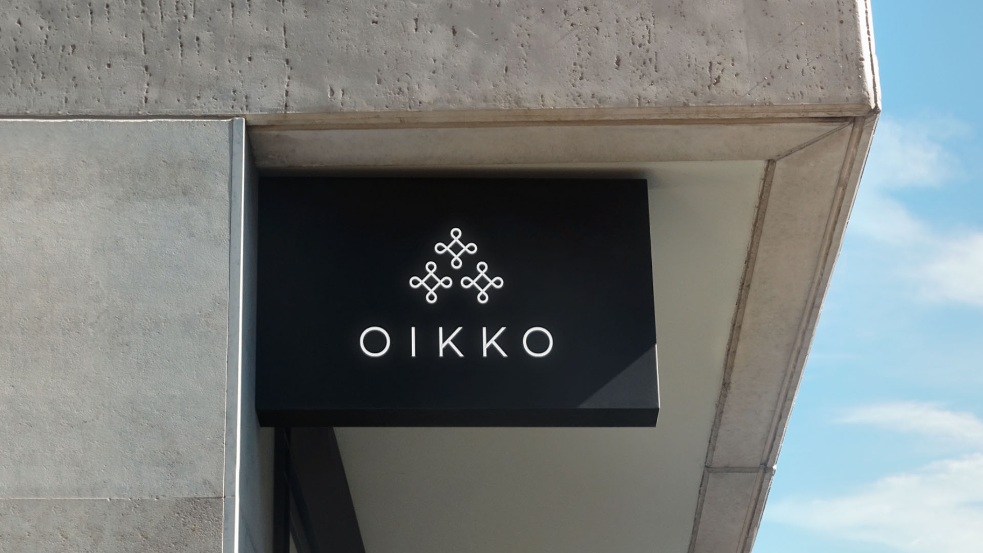
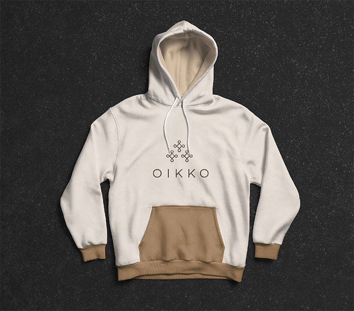
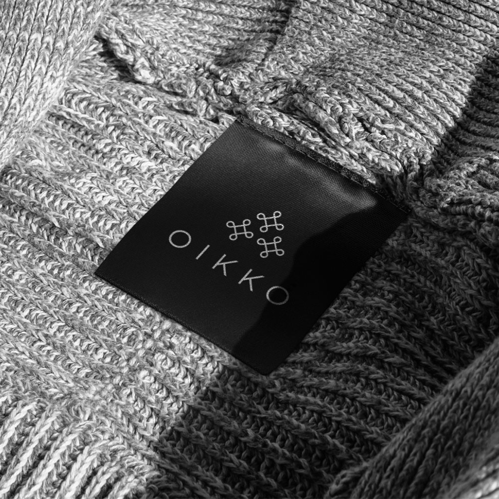
Modular Logo System
The logo for Oikko forms a dynamic brand identity system, encompassing a combination mark, wordmark, and icon. The combination mark merges the brand name with a distinctive symbol, embodying Oikko's essence. Meanwhile, the wordmark presents a stylized representation of the brand name, exuding elegance and authenticity. Derived from the combination mark, the icon serves as a condensed yet impactful symbol suitable for digital platforms and social media. This thoughtfully designed logo system ensures versatility and modularity, empowering Oikko to maintain consistency while adapting seamlessly to various applications.
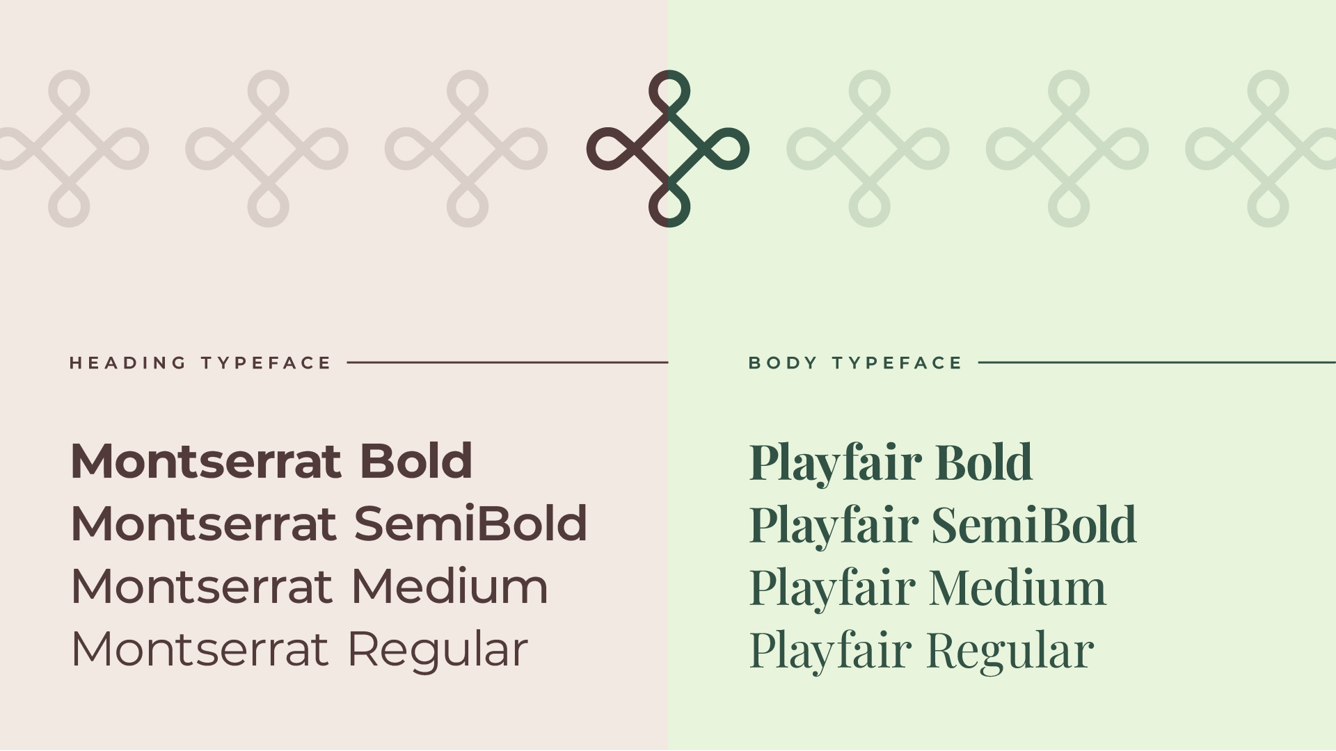
Typography
Typography is integral to Oikko Social Apparels Co.'s brand identity. Montserrat, a clean and versatile sans-serif typeface, represents their modern and simple approach. Customized for the work mark, it adds a unique touch while maintaining consistency. For body text, Playfair, a classic and easy-to-read serif typeface with a high x-height, exudes elegance. The careful pairing of Montserrat and Playfair achieves a harmonious blend, reflecting Oikko's fashion-forward yet responsible ethos.
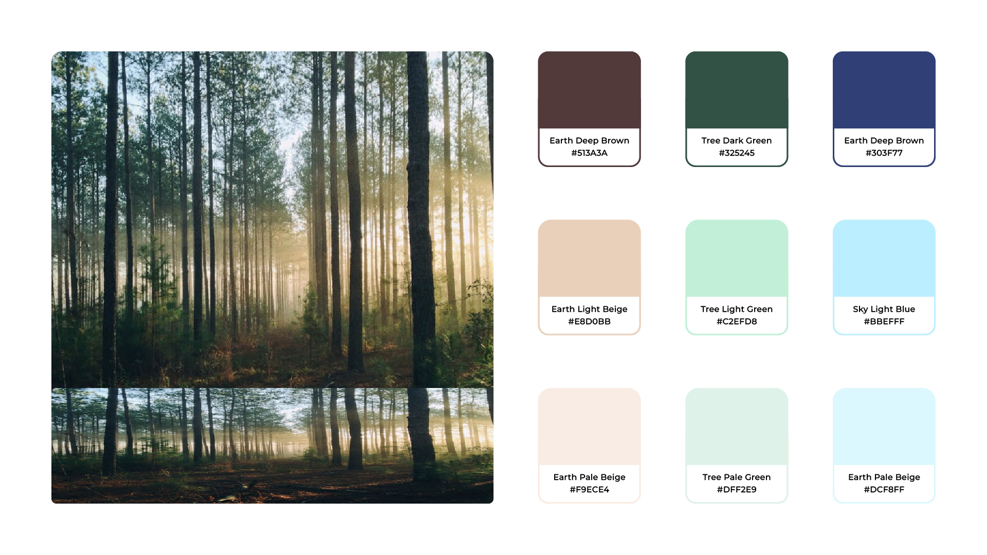
Colors
Earthy browns and beiges represent ethics, equality, and a grounded approach, reflecting the company's commitment to all stakeholders. Greens evoke the beauty of nature and sustainability, symbolizing Oikko's harmonious relationship with the environment. Blues resonate with the sky and atmosphere, signifying cleanliness and trust, reinforcing the brand's reliability and transparency. This thoughtful color palette put together creates an authentic and visually appealing representation of Oikko's mission, reflecting their fusion of style with ethical responsibility.
Ready to transform your vision into design?
Let's talk!
Let's discuss how we can turn your vision into stunning designs, just like Oikko's memorable identity.